Crochet & Color Theory: Choosing Palettes Like a Pro
I used to grab yarn based on what looked nice at the moment. Maybe a pretty pink, a soft grey, something earthy. I’d start a project and halfway through… nope. It didn’t feel right. The colors clashed. Or faded into each other. Or just felt… off.
If you’ve ever unraveled rows because the colors didn’t work together, you’re not alone. That’s where color theory comes in.
And no—you don’t need an art degree. Just a little awareness makes a big difference. Whether you’re making a blanket, a bag, or a baby sweater, understanding how color works in crochet can save you time, yarn, and frustration.
Let’s break it down, together.
What Is Color Theory (And Why Should You Care)?
Color theory is basically how colors interact. That’s it.
You know how some color combos feel relaxing, and others are super energetic? That’s color theory doing its thing.
It helps you:
- Pick colors that look good next to each other
- Create mood or tone with your crochet
- Avoid weird clashes
- Balance warm and cool shades
- Make a project pop—or calm it down
Once you see it, you can’t unsee it. And honestly, it’s kind of addictive.
Why Crochet Makes Color More Tricky (But Also More Fun)
Crochet isn’t painting. The texture adds another layer. Stitches create shadows. Yarn has its own personality—shiny, matte, fuzzy, flat.
Colors behave differently depending on:
- Stitch type – tight stitches vs lacy ones change how a color looks
- Yarn material – cotton is crisper than wool, and it reflects light differently
- Lighting – the color in your room might look different in daylight
That means what looks great in the skein might feel totally different in a finished piece.
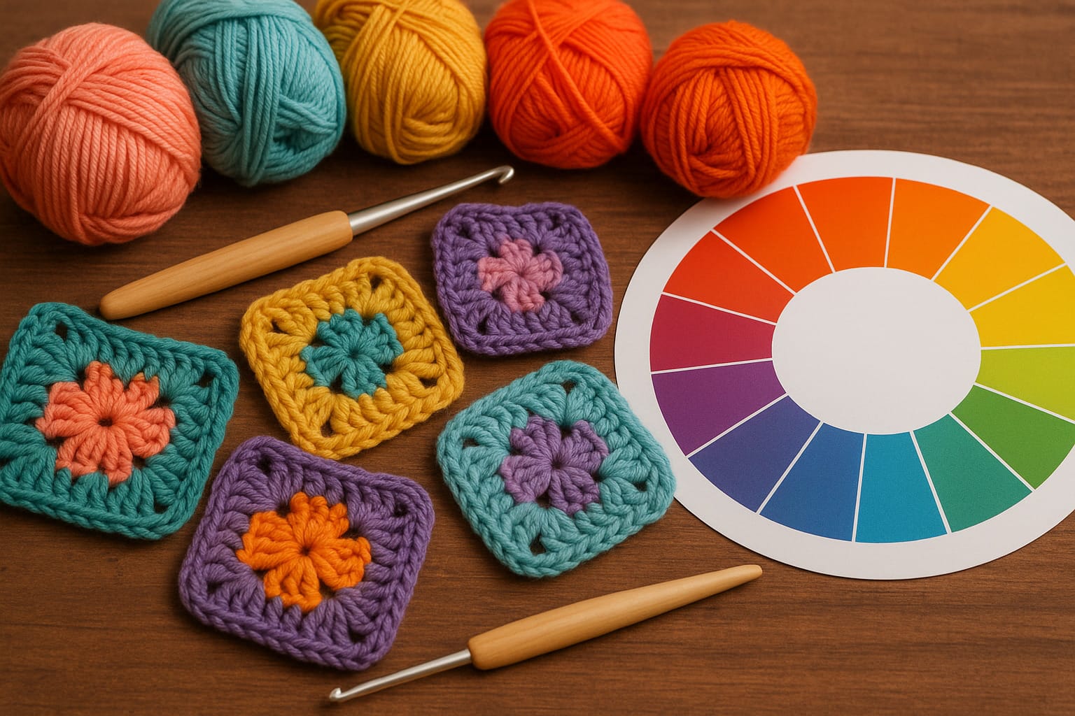
Start with the Color Wheel (But Don’t Panic)
You’ve probably seen it before. That rainbow-looking circle? That’s the basic color wheel. It has 12 main hues:
- 3 primary colors: red, yellow, blue
- 3 secondary: orange, green, purple
- 6 tertiary: combos like red-orange or blue-green
This little wheel can help you build color palettes that actually work.
Here’s how:
1. Complementary Colors (High contrast)
These are opposite each other on the wheel. Think:
- Blue and orange
- Red and green
- Yellow and purple
In crochet, complementary colors add contrast. They stand out. Great for bold designs or borders. Just be careful—they can be a bit loud if used equally. Try making one the main color and using the other in small amounts.
Example: A deep blue blanket with burnt orange accents? Looks intentional. Balanced.
2. Analogous Colors (Soft and safe)
These sit next to each other on the wheel. Like:
- Blue, blue-green, green
- Pink, red, orange
They’re harmonious. Less contrast, more flow. Perfect for:
- Baby items
- Shawls
- Home decor
Tip: Use three shades—one dominant, one supporting, and one accent.
Example: A calming throw in sage, olive, and teal. No clashing. Just vibes.
3. Triadic Colors (Playful and balanced)
These form a triangle on the color wheel. Like:
- Red, blue, yellow
- Purple, orange, green
They feel energetic without being chaotic.
Good for granny squares, toys, and fun blankets. Try using one as the main color and the other two for pop.
Example: A granny square baby blanket using lilac, lemon yellow, and aqua. Balanced and cheerful.
Warm vs Cool: The Mood Shift
Colors give off different feelings.
Warm colors (red, orange, yellow):
- Feel energetic or cozy
- Grab attention
- Can feel intense if overused
Cool colors (blue, green, purple):
- Feel calm or fresh
- Tend to recede
- Work well for relaxed projects
Think about what you want your crochet piece to feel like.
Want a cozy fall scarf? Try rust, mustard, or burgundy.
Making a peaceful baby blanket? Soft blues and pale greens will work nicely.
Neutrals: Your Secret Weapon
Sometimes the magic isn’t in the colors—it’s in the space between them.
Neutrals help balance your palette:
- White, off-white, cream
- Grey (light or charcoal)
- Black or navy
- Beige or tan
Use them:
- Between bright colors to let them breathe
- As borders
- To ground a bold design
Example: If you’re working with hot pink and electric blue, try adding grey or off-white to calm the noise.
Yarn Shopping: What Usually Goes Wrong
Here’s what happens to most of us (me included):
You walk into a yarn store. Everything looks beautiful. You pick colors that look nice side by side in the skein. You start your project. Then… they fight each other. Or blend together too much. Or one just disappears into the background.
Color theory helps you avoid that.
Before buying:
- Check the color wheel (just pull up an image on your phone)
- Think about mood
- Grab yarns and lay them together in different lighting
- Ask: Does one color stand out too much? Does anything feel dull?
You don’t need to overthink. Just be more aware.
A Quick Word on Value and Saturation
This sounds technical, but it matters.
Value = how light or dark a color is
Saturation = how intense or muted it is
Too many mid-tones? Your design might feel flat.
Mixing light, medium, and dark values adds depth.
Example: Let’s say you’re making a ripple blanket. Using three blues—a pale sky blue, a medium denim, and a deep navy—makes it feel layered and interesting.
Common Crochet Color Mistakes
Let’s be honest. We’ve all done at least one of these.
1. Choosing colors too close in value
If two colors are the same “darkness,” they can blend together even if they’re different hues. Try viewing your yarns in black and white (use your phone’s photo filter). Surprising, right?
2. Using all bright colors
Even fun projects need breathing space. Throw in a neutral or a muted tone.
3. Copying online palettes without tweaking
Pinterest is full of gorgeous color combos. But your yarn texture and lighting might change how they look. Test swatches before committing.
Building a Go-To Color Palette
You don’t need to start from scratch every time. Try this:
- Pick 5–7 yarn colors that all work together
- Mix light, dark, muted, and bright
- Include at least one neutral
Use these as your “core” colors. You can build different projects with the same set, and they’ll all feel like they belong together.
It’s like your own little crochet signature.
Trust Your Gut (But Back It Up)
Sometimes your instinct will be spot-on. Other times? Not so much.
If a color combo makes you hesitate, pause. Swatch it. Let it sit. Look at it the next day.
And if you love a combo that breaks every color theory rule? Go for it. You’re the one holding the hook.
A Few Personal Favorites That Always Work
Not sure where to start? Here are some palettes that rarely go wrong:
- Navy + mustard + cream
- Teal + rust + light grey
- Sage + blush + ivory
- Charcoal + soft pink + white
- Olive + terracotta + beige
These are easy to adapt and tweak depending on your yarn stash.
Final Thoughts
Crochet isn’t just about the stitch—it’s about how the colors come together. You don’t need to be a designer or an artist to get it right. Just slow down. Think about how the colors will work once the yarn becomes fabric.
Start simple. Try small projects to experiment. And over time, you’ll find yourself naturally reaching for colors that just work together.
The more you play with color theory in crochet, the better your instincts will get. It’s not about following strict rules—it’s about learning to see what your yarn is really capable of.


